

Let’s Start With the Obvious—Everyone’s on Mobile Now!
Mobile learning isn’t a “maybe we should think about it” kinda thing. It’s already happening.
More than 60% of people access websites on their phones these days—and for course creators like you, that number is probably even higher.
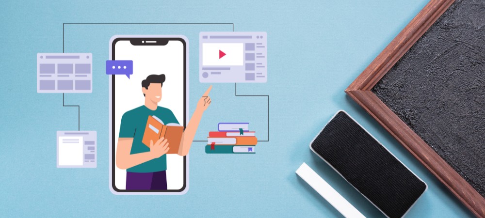
Your learners aren’t sitting at a desk with a cup of coffee and zero distractions. They’re on the bus. In a noisy café. Waiting for their kid at soccer practice. If your course doesn’t work on mobile, it’s kinda broken.
People are squeezing in learning wherever and whenever they can. If your course doesn’t look good or work smoothly on a phone, you’re pushing people away. And it’s not just a matter of design—bad mobile UX can tank your engagement, completions, and reviews before you even realize what’s wrong.
Let me show you what this actually looks like in practice:
Imagine you’re running a professional development academy teaching photography skills. Your student Maria is a busy mother with a full-time job who’s trying to launch her photography side business. Here’s her typical learning pattern:
- Morning: Watches a 7-minute tutorial on composition while waiting for her coffee to brew
- Lunch break: Completes a quick quiz about aperture settings on her phone
- Evening commute: Listens to your podcast episode about lighting techniques
- Weekend: Reviews longer demonstrations when she has more focused time
If your content doesn’t accommodate this fragmented, on-the-go learning pattern, Maria will find another photography course that does. She’s not abandoning your content because it lacks value—she’s leaving because she literally cannot access it when and where she needs it.

Still Making These Mobile eLearning Mistakes? Let’s Fix That
These slip-ups might seem small, but on mobile, they’re deal breakers. Your learners won’t wait for slow videos, hunt for hidden buttons, or rewatch lessons they’ve already done. The good news? Every one of these mistakes is fixable (without rebuilding your whole course). Let’s walk through what to tweak so your mobile eLearning actually works the way your learners expect it to.
1. Building for Desktop First (And Hoping for the Best)
This one’s a classic. You set everything up on your laptop—it looks sleek, professional, and ready to go. Then you open it on your phone and… what the heck happened? Buttons are overlapping, text is microscopic, and the layout’s doing cartwheels.
Real-world example:
Imagine you’re offering a culinary course teaching professional cooking techniques. On desktop, your course outline appears in a beautiful sidebar with drop-down menus for each module. Students can easily navigate between knife skills, cooking methods, and recipe sections.
When a student opens this on mobile, however, that same sidebar becomes an unusable compressed menu at the bottom of the screen. The drop-downs require precise tapping that’s nearly impossible on a phone. Your completion data shows that 65% of mobile users abandon the course after struggling to navigate beyond the second lesson.
What to do instead:
Flip your approach—start small and build out. When redesigning the culinary course above:
- Begin by sketching the mobile interface first, with large, finger-friendly navigation buttons
- Create a simplified vertical course structure that scrolls naturally on phones
- Only then, adapt this streamlined approach for desktop users who have more screen space
Tools that make this easier:
- Use responsive themes like Astra or BuddyBoss that handle device adaptation automatically
- Preview across multiple devices simultaneously with Responsively (free tool)
- Test on real mobile devices using BrowserStack (see exactly how your course appears on different phones)
| Did you know? According to Elearning Industry, 94% of Gen Z Are Learning on Their Phones—Is Your LMS Ready? If you’re building an LMS and it’s not mobile-optimized, you’re missing the mark—big time. 94% of Gen Z use their phones for learning. That means if your course feels clunky or slow on mobile, they’ll bounce before you can say “lesson one.” Mobile eLearning isn’t a feature—it’s the foundation. Design for their thumbs, not your desktop.  Image by pikisuperstar freepik |
2. Overloading with Heavy Stuff
Big background images, autoplay videos, animations galore—it all feels cool until your site takes 8 seconds to load on mobile data and your learner is already back on Instagram.
Real-world example:
Let’s say you’ve created a comprehensive digital marketing course. Your welcome module includes a beautiful 4K video introduction that automatically plays when students first log in. The video showcases animated graphics of marketing metrics, testimonials, and course highlights.
On a desktop with high-speed internet, it looks spectacular. But what happens when your mobile learners try to access it?
- A marketing professional trying to access your course during a train commute faces buffering that never seems to end
- A student using campus Wi-Fi experiences crashes whenever the video tries to load
- An international learner with data limitations abandons the course after it consumes most of their monthly data allotment
What to do instead:
- Create mobile-specific media assets that prioritize speed and accessibility
- Disable autoplay for all video content
- Compress images without sacrificing quality
- Provide text alternatives for all major visual content
For example, the digital marketing course could:
- Offer a compressed 720p version of the welcome video specifically for mobile users
- Make video playback optional rather than automatic
- Replace animated graphics with static infographics that load faster
- Include a text summary of the video for those who can’t or prefer not to stream
| Tools that save the day: TinyPNG – crushes image file sizes without killing quality Cloudflare – speeds up your site with a free CDN. PageSpeed Insights – Google tells you exactly what’s slowing down your mobile site |
3. Never Testing on Actual Phones
This one’s sneaky. You preview in Chrome, it kinda looks okay, and you move on. But Chrome’s “mobile view” isn’t real life. Real phones have weird screen sizes, clumsy fingers, and iffy internet.

Real-world example:
Consider a language learning platform offering conversational Spanish courses. The course includes interactive exercises where students need to drag and drop words to form proper sentences.
In desktop testing and browser-based mobile simulators, everything functions perfectly. But when actual students use the course:
- iPhone users find that the drag function doesn’t register properly on iOS Safari
- Android users with smaller screens can’t see all the word options at once
- The submit button sits directly under the keyboard on most devices, making it impossible to tap without dismissing the keyboard first
The result? Your analytics show that only 23% of mobile learners complete the interactive portions of your course, while desktop completion rates remain above 87%.
What to do instead:
- Implement systematic testing on actual mobile devices
- Create a test protocol covering different operating systems (iOS/Android), screen sizes, and browsers
- Recruit a small group of beta testers who use different devices to identify issues before full launch
For the language course specifically:
- Redesign drag-and-drop exercises as tap-to-select activities that work better on touchscreens
- Implement responsive layouts that adjust automatically to different screen sizes
- Move the submit button to a fixed position at the top of the screen, away from keyboard interference
Use:
- BrowserStack for multi-device testing
- Or just… your phone. Keep it real.
4. Progress Doesn’t Sync Across Devices
Picture this: someone starts your course on their tablet at lunch, gets home, opens their phone, and the course resets. Nobody remembers where they left off. That’s a fast track to “meh, I’ll do it later.”
Real-world example:
Imagine you offer a professional certification course for project management. Your learners typically begin modules during weekday lunch breaks on their phones, then continue with more focused study on laptops during evenings and weekends.
Without cross-device syncing, your learners experience frustrating scenarios like:
- A student completes three modules on their phone over several lunch breaks, then opens the course on their laptop to find all progress lost
- A professional reaches the end of a difficult module on their tablet, then needs to repeat the entire section when they switch to a desktop to take the final assessment
- A busy parent studies whenever they can grab a few minutes on whatever device is available, but constantly loses track of where they left off
Your course analysis reveals that students who switch between devices are 73% more likely to abandon certification programs before completion.
What to do instead:
- Implement cloud-based progress tracking that updates in real-time across all devices
- Add visual indicators showing exactly where learners left off, regardless of which device they were using
- Enable bookmarking functionality so students can manually mark important points to return to
For the project management certification:
- Implement cloud synchronization that updates progress status every 30 seconds
- Add a prominent “Resume Where You Left Off” button on the dashboard
- Include timestamps with device information (“Last studied Module 3.2 on Mobile, 2 hours ago”)
Tools: Choose an LMS or plugin setup that syncs progress in real time. Most modern ones (like LearnDash with Tin Canny or Uncanny Toolkit) handle this well.
Bonus tool: WP Fusion can help you track logged-in users and even sync data with CRMs.
5. Burying Your Call-To-Actions
You’ve got a great “Start Now” button. The problem is, on mobile it’s either:
a) shoved into a hamburger menu
b) hidden under a mountain of text
c) completely missing
| Real-World Case Study An e-commerce brand partnered with Convertica to improve mobile conversions. Their big move? Adding a sticky “Add to Cart” button that stayed visible as users scrolled. The results were massive: 252.9% increase in mobile order completions 252.9% lift in revenue per mobile visitor 98% confidence in test results Keeping the CTA in plain sight made it easier for users to act without hunting around, facilitating a smooth user experience. It proved just how powerful CTA visibility can be, especially on mobile. Source: Convertica Case Study |
Fix it fast: Put your main CTA (buy, resume, enroll) right there—big, bold, and tappable. The top and bottom of the screen are ideal.
6. No Offline Access = No Chill for Learners
Not everyone’s online all the time. Some learners are on patchy connections, flights, or just conserving data. If your course requires perfect internet to work, you’re leaving folks out.
Real-world example:
Imagine you’ve developed a comprehensive nursing certification program. Your students often study between shifts, during commutes on public transportation, or in hospital break rooms where Wi-Fi can be unreliable.
Without offline capabilities, your students face scenarios like:
- A nurse trying to review procedures while on the subway can’t access any materials once the train goes underground
- A student in a rural clinical rotation has spotty cell service and can’t stream essential video demonstrations
- A traveling healthcare worker wants to study during a long flight, but can’t access any course materials
Your support team receives frequent complaints about accessibility issues, and your completion analytics show that lessons requiring sustained internet connections have 37% lower completion rates than text-based modules.
What to do instead:
- Create downloadable versions of all critical course materials
- Enable video preloading when on Wi-Fi for later offline viewing
- Implement progressive web app (PWA) technology to cache course content locally
- Design your course to sync progress when connections resume
For the nursing program specifically:
- Convert all procedure videos to downloadable MP4 files that can be stored locally
- Create PDF versions of all illustrated guides and clinical references
- Implement offline quiz functionality that stores responses locally until connectivity returns
- Add a “Download for Offline” button prominently on each module page
Easy wins: Add downloadable transcripts, slides, and cheat sheets. If possible, let them save video lessons offline using tools like Vimeo OTT or course platforms like Thinkific that support offline viewing.
7. Not Having Responsive Assessments (And Losing Learners Fast)
Let’s be real—nobody wants to wrestle with a tiny multiple-choice button on a 5-inch screen while they’re stuck on a bus.
And yet… so many LMS quizzes are basically desktop puzzles that totally fall apart on mobile. Tiny radio buttons, answer fields that cut off mid-word, drag-and-drop quizzes that don’t “drop” where they should… It’s brutal.
| Imagine You offer a professional development course for financial advisors that includes certification quizzes. On desktop, your assessments include various question types: multiple-choice, drag-and-drop matching, image-based selections, and short text responses. When financial advisors attempt these quizzes on mobile devices during their commutes or between client meetings, they encounter: Drag-and-drop elements that don’t respond properly to touch gestures Text entry fields that get obscured by the mobile keyboard Image-based questions where selections are too small to accurately tap Timed assessments that become impossible to complete due to interface struggles Your completion data shows that while 94% of desktop users complete certification quizzes on the first attempt, mobile users have a 61% abandonment rate during assessment sections. What to do instead: -Design mobile-specific assessment formats that work naturally with touch interfaces -Simplify complex question types for smaller screens -Increase tap target sizes for all interactive elements -Adjust time allowances for mobile test-takers For the financial advisor course specifically: -Replace drag-and-drop matching with simple tap-to-select matching options -Implement larger, finger-friendly selection areas for all choices -Position text entry fields at the top of the screen so they remain visible when the keyboard appears -Add 25% additional time for assessments taken on mobile devices |
Mobile assessment best practices:
- Use large, easily tappable buttons (minimum 44×44 pixels)
- Stick with simple selection formats: multiple-choice, true/false, and simple dropdown selectors
- For text entry, keep fields brief and visible above the keyboard area
- Test all quiz functionality with actual finger taps, not mouse clicks
Mobile eLearning Hacks: What Smart Course Creators Are Doing Right
We’ve roasted the mistakes—now let’s talk about what to do instead. These aren’t rocket science moves, just smart, practical tweaks that make a huge difference for your learners.
1. Design Like Everyone’s Using Their Phone (Because They Probably Are)
Let’s stop pretending people are sitting at a big desk with two monitors. They’re probably on their couch, phone in one hand, snack in the other.
So ditch the sidebars, fancy hover menus, and tiny text. Go for clean, vertical layouts. Big buttons. Scrollable sections. Easy-peasy navigation.

How to implement this approach:
- Embrace vertical scrolling: Organize content in a single column that flows naturally down the page
- Design for thumb zones: Place important navigation and actions where thumbs naturally rest when holding a phone
- Eliminate unnecessary elements: Each screen element should serve a critical purpose
- Use progressive disclosure: Reveal information gradually instead of overwhelming screens with content
Tools that help:
- Use mobile-first themes like Astra or BuddyBoss
- Test early with Responsively App or your actual phone (seriously, just open it up!)
2. Make Your Videos Mobile-Friendly (Because No One’s Watching 4K on 3G)
HD is cool—until it eats mobile data like candy and crashes someone’s phone. Mobile learners want smooth playback, maybe captions, and the option to download for later.
Real-life hack: Let people control playback speed (so they can speed-run your course), and offer downloadable slides or PDFs as backups.
How to implement mobile-friendly video:
- Keep videos short and focused: 3-5 minutes per concept is ideal for mobile viewing
- Optimize for variable bandwidth: Create multiple resolution options (720p is sufficient for most mobile learning)
- Enable playback controls: Let users adjust speed, rewind/forward in small increments, and save their place
- Always provide alternatives: Include transcripts, summaries, and static images covering the same material
Tools that help:
- Host on Vimeo or YouTube (unlisted)
- Use Loom or ScreenPal to record quick lessons that don’t weigh a ton.
| Example John, a course creator, uploaded crisp, full-HD videos to their LMS. Looked amazing on desktop, but mobile learners complained about buffering, lag, and app crashes. After switching to compressed formats and adding playback speed controls, their drop-off rate on video lessons was cut in half. After the analyses, John discovered that over 60% of learners accessed the course via mobile, and most of them were abandoning lessons within the first 2 minutes. |
3. Keep It Fast—Nobody’s Got Time for Spinners
Mobile users are impatient. If your lesson takes more than 3 seconds to load, they’re probably out.
Shrink the fat. Compress your images. Ditch the five-paragraph intros. Make sure every page feels snappy.
How to implement speed improvements:
- Compress all images: Reduce file sizes without visibly affecting quality
- Implement lazy loading: Only load images and videos when they’re about to enter the viewport
- Minimize HTTP requests: Combine CSS and JavaScript files where possible
- Use browser caching: Set appropriate cache lifetimes so returning visitors load content faster
Tools that help:
- TinyPNG for compressing images
- E-learning Technical Health Checker to see what’s slowing you down.
- Cloudflare for faster delivery (bonus: it’s free)
4. Build for Thumbs, Not Mice
On mobile, people are tapping, not clicking. And if your buttons are too close together or too tiny to hit without zooming, that’s a rage-click waiting to happen.
Make everything thumb-friendly. Use sticky menus that follow the user. Keep forms short. Avoid dropdowns from hell.
How to implement thumb-friendly design:
- Size all interactive elements appropriately: Buttons, links, and form elements should be at least 44-48 pixels in size
- Mind the thumb zone: Place frequent actions within easy thumb reach (typically bottom and center of screen)
- Provide clear visual feedback: Show users when taps are registered through immediate visual changes
- Minimize typing requirements: Use selection controls instead of text entry whenever possible
Bonus tip: Put “Resume Learning” or “Next Lesson” where people can easily tap—no hunting required.
Want to know what’s slowing your mobile course down? The eLearning Technical Health Checker is a free tool that scans your site, flags media-heavy pages, and shows you exactly what’s hurting your mobile performance. It gives you clear, prioritized actions—so you’re not just guessing where to start. |
5. Let People Pick Up Where They Left Off
Learners bounce between devices all the time. Tablet at lunch. Phone on the bus. Laptop at night.
If they have to restart every time they switch devices, you’ve lost ‘em.
How to implement seamless progress tracking:
- Use cloud-based progress storage: Ensure all activity syncs to a central database, not just local storage
- Track granular progress points: Record specific page positions, video timestamps, and micro-completions
- Make resumption prominent and effortless: Add large, obvious “Continue” buttons on the dashboard
- Provide contextual reminders: Show users exactly what they were working on and where they paused
Tools that help:
- LearnDash + Uncanny Toolkit for real-time progress tracking
- TutorLMS with sync add-ons
- Or consider using WP Fusion to carry user data across platforms.
6. Keep Interactions Simple (Because Drag-and-Drop is a Mess on Mobile)
On a desktop, interactive stuff is fun. On mobile? Not so much. Drag-and-drop, hover-only features, or fill-in-the-blanks are just… annoying.
Keep your activities mobile-proof. Stick with multiple-choice, checkboxes, and short answers. And double-check quizzes on your phone—just to be sure they’re not a pain to use.
How to implement mobile-friendly interactions:
- Favor taps over drags: Replace drag-and-drop with tap-to-select whenever possible
- Break complex interactions into steps: Guide users through sequential actions rather than requiring complex manipulations
- Provide multiple interaction options: Allow users to choose between different ways to complete an activity
- Test with actual devices: What works in theory often fails in practice—always test with real phones
Best practices for mobile quizzes and assessments:
- Use large, easily tappable multiple-choice options
- Implement vertical scrolling rather than horizontal for options
- Keep form fields to a minimum with appropriate mobile keyboard types
- Allow partial progress saving for longer assessments
How Mobile eLearning (with a Twist of Gaming) Transformed Sales Onboarding: Real Life Case
Background: A rural non-banking finance company (NBFC) in India, with over 1,500 front-line sales executives, aimed to streamline its onboarding process.
Problem:
- Way too long (four days off the field = missed sales).
- Expensive to run repeatedly in person.
- Not accessible for folks in remote areas.
- And completely unengaging. Think: long lectures, zero interaction, no follow-up.
Solution:
- 100% Mobile-Ready: Everything was designed to run smoothly on a phone. Reps could train while commuting, waiting for a client, or even during lunch. No laptop required.
- Gamified Learning: They turned onboarding into a game. Points, badges, avatars—the whole nine yards. Learners stayed hooked.
- Bite-Sized Lessons: Each module was just long enough to be useful, short enough to do on the go.
- Offline-Friendly: Once downloaded, the lessons didn’t need constant internet, crucial for reps in rural areas.
- Trackable & Scalable: Plugged into the company’s LMS to track progress and LMS performance, just like any formal training.
Result:
- Training time dropped from 4 days to just 5.5 hours.
- Engagement shot up because reps actually wanted to use the app.
- Access was never an issue—everyone had a phone, and that’s all they needed.
- Ongoing learning became possible because reps could pop open the app whenever they needed a quick refresher.
- Cost of training went down—fewer trainers, fewer travel costs, way more scale.
Wrapping It Up: Why Mobile eLearning Is Your Secret Weapon
Let’s be real—your learners are busy. They’re scrolling on the train, watching lessons on the go, and trying to sneak in learning between life’s chaos. If your course doesn’t work on mobile, you’re not just behind—you’re invisible to most of your audience.
The good news? Mobile eLearning doesn’t have to be complicated. Start by fixing the basics, and use eLearning Technical Health Checker to see where your mobile experience needs help. Fix what’s broken: make it responsive, keep it light, test it on real phones, and always design with the mobile user in mind.
And hey, the benefits are real:
💸 Lower bounce rates
📈 Higher completion rates
📱 More learners are engaging when and where it works for them