
You’ve probably heard the term “responsive” tossed around in web design circles for years. It usually means a site that works well on all screen sizes.
But when it comes to online courses, what does responsive design really look like? And more importantly, how does it impact your learners’ experience and your course’s performance?
In this article, we’ll take a closer look at how the concept of responsiveness goes beyond just mobile-friendliness and why it plays a much bigger role in boosting engagement, retention, and enrollment for modern course creators.
The Problem with “Almost Responsive” eLearning Websites
Even if your LMS technically “works,” some subtle design choices might still be holding your course back. Let’s look at a few of those silent blockers.
A Hidden Lag in Interaction Design
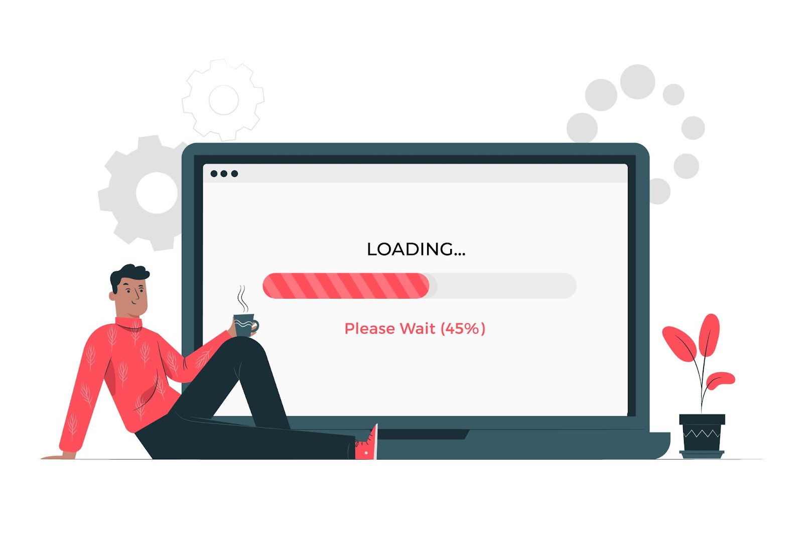
Your course might pass the speed test, but does it feel fast?
There’s a big difference between a site that loads in three seconds and one that responds instantly to taps, scrolls, and clicks. If learners are waiting for videos to buffer or if interactive elements like quizzes or buttons respond sluggishly, especially on mobile, it creates friction. Even minor scroll delays can affect how learners perceive your course.
Think of platforms like Netflix. You don’t just want it to open—you expect it to run smoothly, without delays. That’s the same expectation modern learners bring to your LMS.
Real-world impact: Consider an instructor who recently launched a professional development course. Their analytics showed that 65% of visitors accessed the site on mobile devices, but the conversion rate was 3x lower on mobile compared to desktop. The culprit? While pages technically loaded within acceptable timeframes, interactive elements like quiz buttons had a 300ms delay on mobile, just enough lag to create friction and uncertainty for users.
How to identify this issue: Try completing your registration process on a mid-range smartphone with average network conditions (not your high-speed office connection). Pay attention to:
- How quickly does the page respond when you tap a button?
- Is there a noticeable delay between tapping and seeing feedback?
- Do you ever find yourself tapping multiple times because you’re unsure if the first tap registered?
Fix it: Implement these practical solutions:
- Use lightweight JavaScript frameworks like Alpine.js or Svelte that provide responsive interactions without the bloat
- Implement skeleton screens during loading rather than spinners (example: show the outline of content while it loads)
- Add immediate visual feedback to taps and clicks (subtle animations or color changes)
- Test your site’s First Input Delay (FID) and Interaction to Next Paint (INP) using tools like PageSpeed Insights, and aim for scores under 100ms
Test your site’s perceived performance using an effective AI tool. Look beyond load time and check metrics like First Input Delay (FID) and Time to Interactive (TTI) to get a more realistic picture.
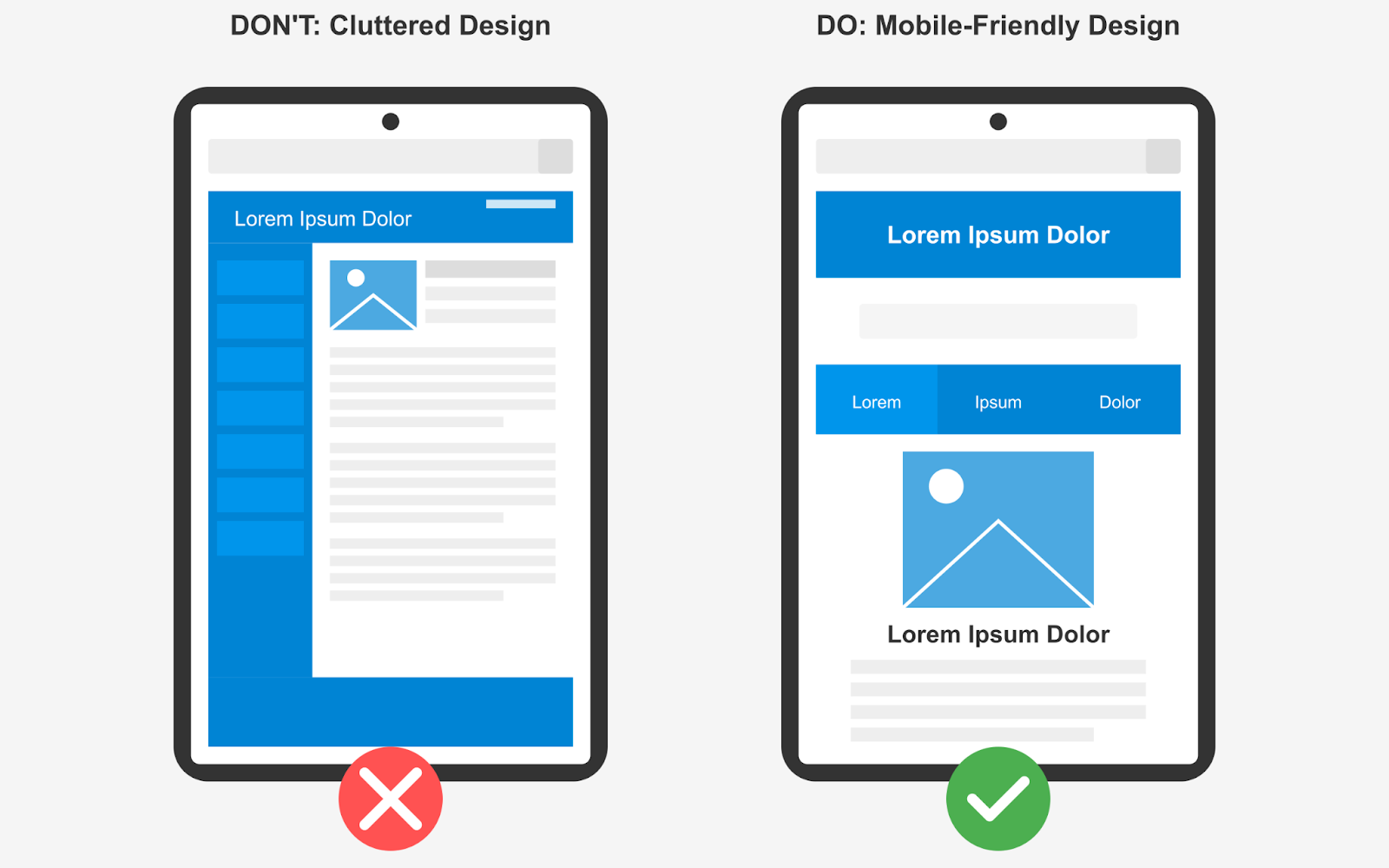
The One-Size-Fits-All Design Trap
Just because your theme is labeled “responsive” doesn’t mean it delivers a personalized experience.
If learners on desktops and mobile devices see the same layout, or if someone on a weak internet connection is served heavy media files, it can seriously disrupt engagement. What works well on a wide screen with fast Wi-Fi won’t always translate to a phone on 4G in a noisy environment.
It’s like handing the same gear to a mountain climber and a jogger. Technically, it fits, but it’s not designed for how they’re using it.
Real-world impact: Imagine you’re managing a language learning business with a strong online presence. Your platform features engaging, video-heavy lessons. On desktop, engagement rates are high—learners are completing lessons and interacting with the content. However, you begin to notice that on mobile devices, users are dropping off at a much higher rate.
You start to wonder: what’s causing this difference? Upon investigation, you discover that mobile users are being served the same high-definition videos as desktop users. This leads to buffering issues and higher data consumption, which can be frustrating for those on mobile connections.
How to identify this issue: Audit your course with these questions:
- Does your content adapt based on user context, or is it merely resized?
- Are mobile users being served the same heavy media files as desktop users?
- Does navigation make sense for touch interfaces, or is it optimized for mouse clicking?
Fix it: Implement context-aware optimizations:
- Use responsive images with the srcset attribute to deliver appropriately sized images based on screen size
- Implement adaptive video streaming that detects connection speed and adjusts quality accordingly
- Redesign navigation for touch interfaces with larger tap targets (minimum 44×44 pixels)
- Create conditional content flows that simplify complex interactions on smaller screens
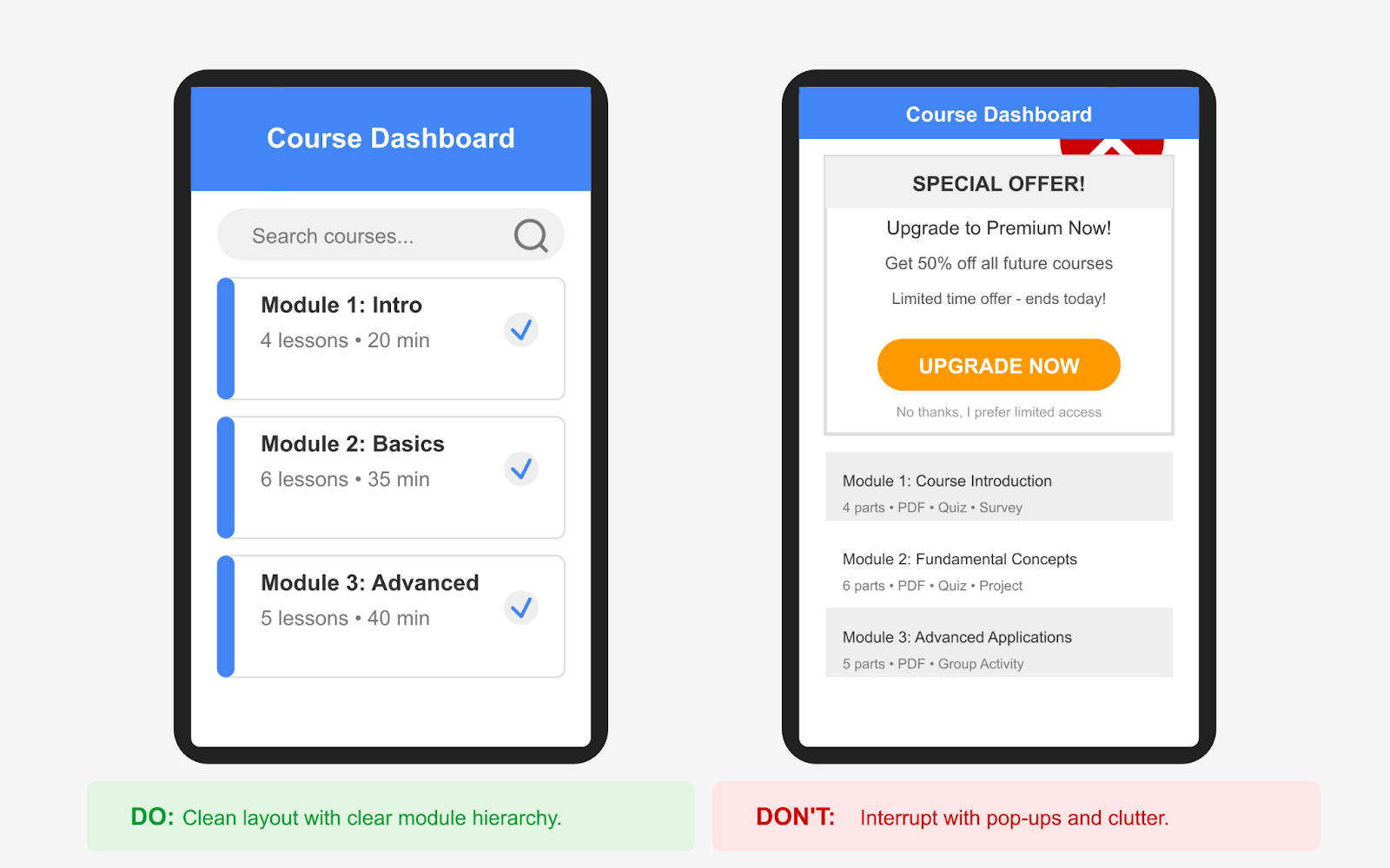
Layout Fatigue: When “Clean” Feels Boring
Minimalist design has its place—but if it leaves learners feeling lost, unmotivated, or unsure of their progress, it’s working against you.
Real-world impact: Imagine you oversee a professional certification program. You’re tracking completion rates across your curriculum and notice a puzzling trend: some courses with identical content have very different completion rates. After digging deeper, you realize the main difference is how each course visualizes and celebrates learner progress throughout the journey.
How to check for this issue: Evaluate your course layout with these questions:
- Do learners always know exactly where they are in the course journey?
- Are there visual rewards or encouragement elements as progress is made?
- Does the interface adapt to maintain momentum as learners advance?
Fix it: Implement these motivation-enhancing features:
- Add progress visualization that works across devices (circular progress indicators work well on mobile)
- Incorporate milestone celebrations that feel natural, not intrusive
- Use conditional content to show encouraging messages based on progress patterns
- Implement “continue learning” features that make resuming obvious across any device
Platforms like Duolingo are great at this. They use progress bars, subtle animations, and even celebratory nudges to keep learners engaged.
Bonus Tip: Try adding lightweight micro-UX elements—like “You’re halfway there” banners, hover effects, or smart transitions between lessons. These touches are easy to implement with lightweight JavaScript and won’t slow down your course.
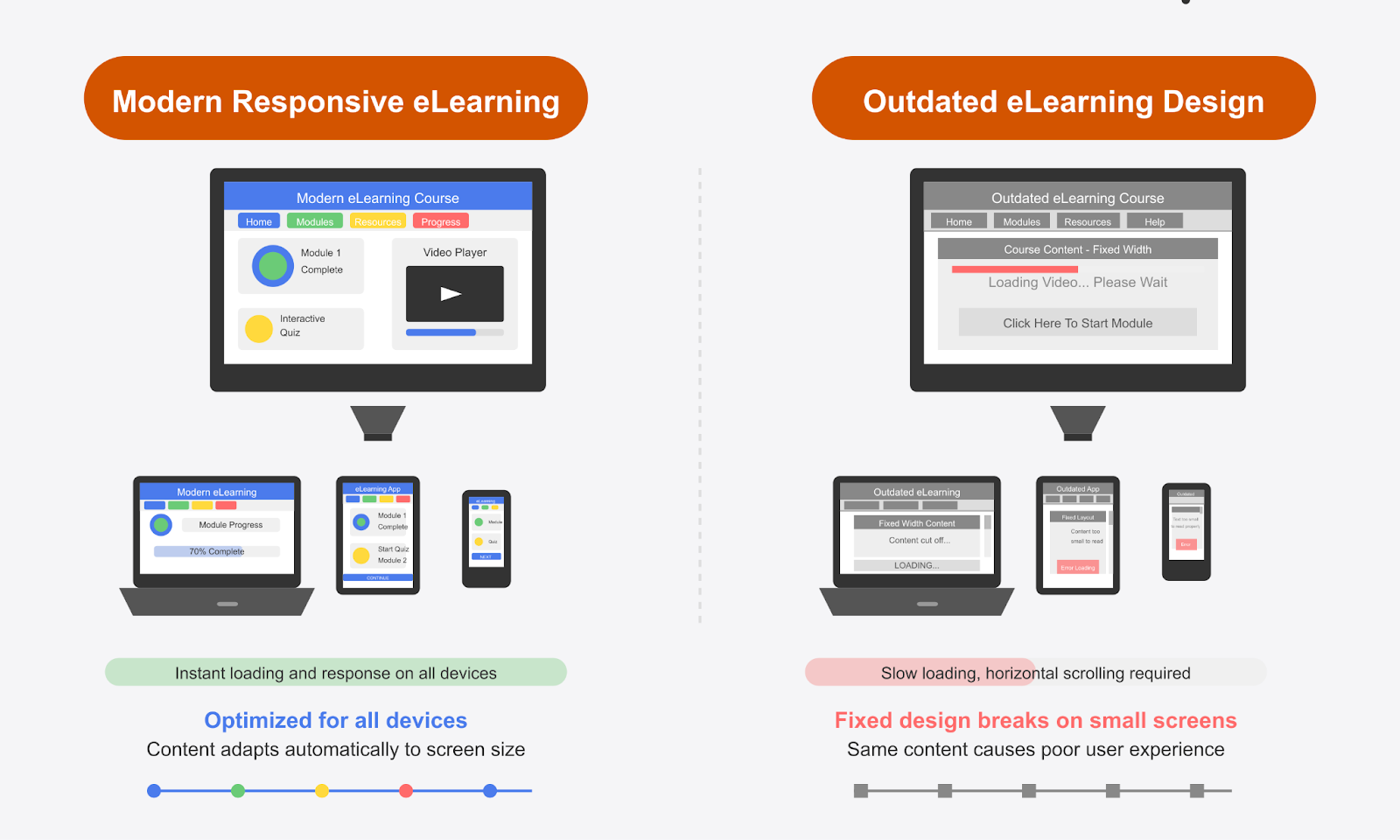
What Is Responsive eLearning Design?
Responsive eLearning design is all about making sure your course looks good and works well no matter what device someone is using—whether it’s a laptop, tablet, or phone.
Instead of creating different versions for each screen size, you design one course that automatically adjusts itself to fit. The layout, text size, images, and navigation elements rearrange to give learners a smooth experience across devices.
This means:
- No awkward zooming or side-scrolling on mobile
- Content loads cleanly and clearly on smaller screens
- Navigation stays intuitive, whether you’re clicking with a mouse or tapping with a thumb
It’s not just about flexibility—it’s about convenience. Learners can start a course on their desktop, continue it on their phone during a commute, and maybe finish it on a tablet later that night, all without any hiccups.
Plus, it’s cost-effective. Instead of hiring a larger team to build and manage different layouts, you can get a great learning experience up and running with fewer hands on deck.
With responsive eLearning design, you’re not building a course for devices—you’re building it for learners, no matter how or where they access it.
The Tangible Benefits of True Responsiveness
When implemented properly, responsive eLearning design delivers measurable improvements:
- Increased enrollment conversions – Students who can easily browse and sign up on any device are more likely to complete registration
- Higher completion rates – Removing friction from the learning process keeps students engaged and progressing
- Better knowledge retention – When the interface doesn’t compete for cognitive resources, students can focus on the actual content
- More positive reviews – Students who enjoy a seamless experience are more likely to recommend your course to others
- Reduced support requests – Fewer technical issues mean less time troubleshooting and more time teaching
| Responsive eLearning Design in Action Anika is a freelance designer trying to upskill in UX. She starts a module at home on her desktop, but has to leave mid-way to pick up her daughter from school. While waiting in the car, she pulls out her phone and picks up right where she left off—no pinch-zooming, no distorted layouts. Later that night, she reviews a few quizzes on her iPad while relaxing on the couch. In this way, learning becomes continuous—it fits into everyday life, instead of demanding special effort or extra time. |
Now That You Know What Responsive eLearning Design Really Means…
Let’s look at some important things to keep in mind while implementing it.
Because responsive design isn’t just a checkbox—it’s a series of smart, practical decisions that shape how your course performs across devices, screen sizes, and learner environments. From layout choices to interaction patterns, even small tweaks can have a big impact on how learners experience your content.
Here’s what to watch for as you start building a truly responsive eLearning experience.
Go Beyond Just Mobile and Desktop
Yes, mobile usage is huge—and growing. In fact, according to Statista, In the last quarter of 2024, mobile devices (excluding tablets) generated 62.54 percent of global website traffic.
But that doesn’t mean you should stop at designing only for mobile and desktop.
The reality of modern learning: Students access courses from an ever-expanding ecosystem of devices:
- Tablets in various orientations
- 2-in-1 convertible laptops
- Smart TVs for video content
- E-readers for text-heavy materials
- Older devices with limited capabilities
- Multiple windows on large monitors
Sticking only to mainstream devices could unintentionally exclude a portion of your audience.
Practical implementation: Instead of designing for specific devices, build with flexibility in mind:
- Use container queries in addition to media queries – This allows content to respond to its immediate space rather than just the overall screen size
- Test with device emulators across the spectrum – Tools like Chrome DevTools’ Device Mode let you preview your course on numerous device profiles
- Implement feature detection rather than device detection – Use capabilities (touch support, screen size, connection speed) to determine presentation, not device type
javascript
Responsive eLearning should create one version of your course that works across all platforms, without forcing you to design different layouts for each. This not only simplifies your workflow but also ensures a more inclusive learning experience.
Pro tip: If a significant portion of your audience uses older systems, run quick compatibility checks to make sure the experience isn’t broken on those devices.
Responsiveness Means More Than Resizing
A truly responsive design goes well beyond just resizing videos or stacking columns. It considers how interaction and usability change depending on the device in use.
Here’s how you can make that happen:
- Show the important stuff first: On smaller screens, bring lesson titles, progress bars, and key actions up front. Save extras for later.
- Use swipe-friendly navigation: Instead of hidden menus, make it easy to swipe through lessons, especially on phones and tablets.
- Load lighter media on slow connections: Use lower-quality videos or compressed images for learners on weaker networks, so they’re not stuck waiting.
- Tap instead of hover: Hover effects don’t work well on touchscreens. Make sure tooltips and buttons respond to taps, not just mouse hovers.
| Bonus Tip 🔥 Some older devices or browsers may not fully support responsive features. Run a quick compatibility check before launch, and where possible, offer fallback layouts or simplified views so learners on older systems still have a smooth experience. |
| Related Reading: Is Your LMS User Experience Hurting Enrollments? Watch For These Signs |
A/B Test Course Layouts and UX Elements That Actually Matter
Course creators who test layout changes get data-backed insights into what drives engagement, retention, and enrollment.
But if you’re only testing button colors or text size, you’re leaving bigger wins on the table.
Smart A/B test ideas:
- Navigation patterns:
- Traditional course outline vs. guided journey approach
- Fixed sidebar vs. collapsible menu vs. bottom navigation on mobile
- Compare completion rates between different navigation systems
- Content presentation:
- Video-first vs. text-first with video supplement
- Interactive practice exercises integrated with content vs. separated
- Long-form lessons vs. microlearning chunks
- Progress visualization:
- Linear progress bars vs. milestone-based progress
- Persistent progress indicators vs. on-demand progress views
- Different reward/celebration implementations at completion points
- Call-to-action placement and design:
- In-content CTAs vs. end-of-section CTAs
- Fixed floating CTAs vs. contextual embedded CTAs
- Different enrollment button designs and placements
| Bonus Tip 🔥 Tools like Google Optimize, Convert.com, or WordPress plugins like Elementor Pro can help you run these tests even without deep coding knowledge.Start simple—but test what matters. Layout decisions impact learning flow, and even a 1% boost in engagement per module can compound across a full course. |
Don’t Wait for Sales Reports—Spot Drop-Offs While the Course Is Live
If you wait for post-launch metrics like enrollments or revenue to evaluate your course, you’re missing valuable early warning signs.
Instead, start analyzing engagement as soon as your course is live.
Key metrics to monitor in real-time:
- Page-specific bounce rates – Identify which specific pages or lessons are driving students away
- Time to first meaningful interaction – How long before students actively engage with course content
- Device-specific completion rates – Compare how different devices affect the likelihood of completion
- Navigation patterns – Identify where students get lost or confused in your course structure
- Form abandonment points – Pinpoint exactly where potential students give up during enrollment
Implementation tools and approaches:
- Use heatmap tools to visualize where users interact (or struggle) with your interface
- Implement funnel analysis to track the complete student journey from first visit to course completion
- Set up automated alerts for unusual drop-off patterns or sudden changes in engagement metrics
| Bonus Tip 🔥 Tools like Microsoft Clarity and PostHog can help track learner engagement and let you spot behavior patterns, drop-off points, or mobile usability issues as they happen. |
| Quick Check Before You Launch Before you hit publish, run your course site through the eLearning Technical Health Checker. It’s a free tool that helps you catch things you might’ve missed—like buttons that don’t work, videos that load too slowly, or layouts that break on mobile. You’ll get a clear report that shows what to fix, so your learners don’t run into issues on day one. It’s a simple step that helps you launch with confidence and gives your students a smooth, frustration-free experience right from the start. |
Add Lightweight Features That Learners Actually Use
You don’t need to overwhelm your course with flashy features. What learners really appreciate are simple, thoughtful touches that make studying easier, no matter where or how they’re learning.
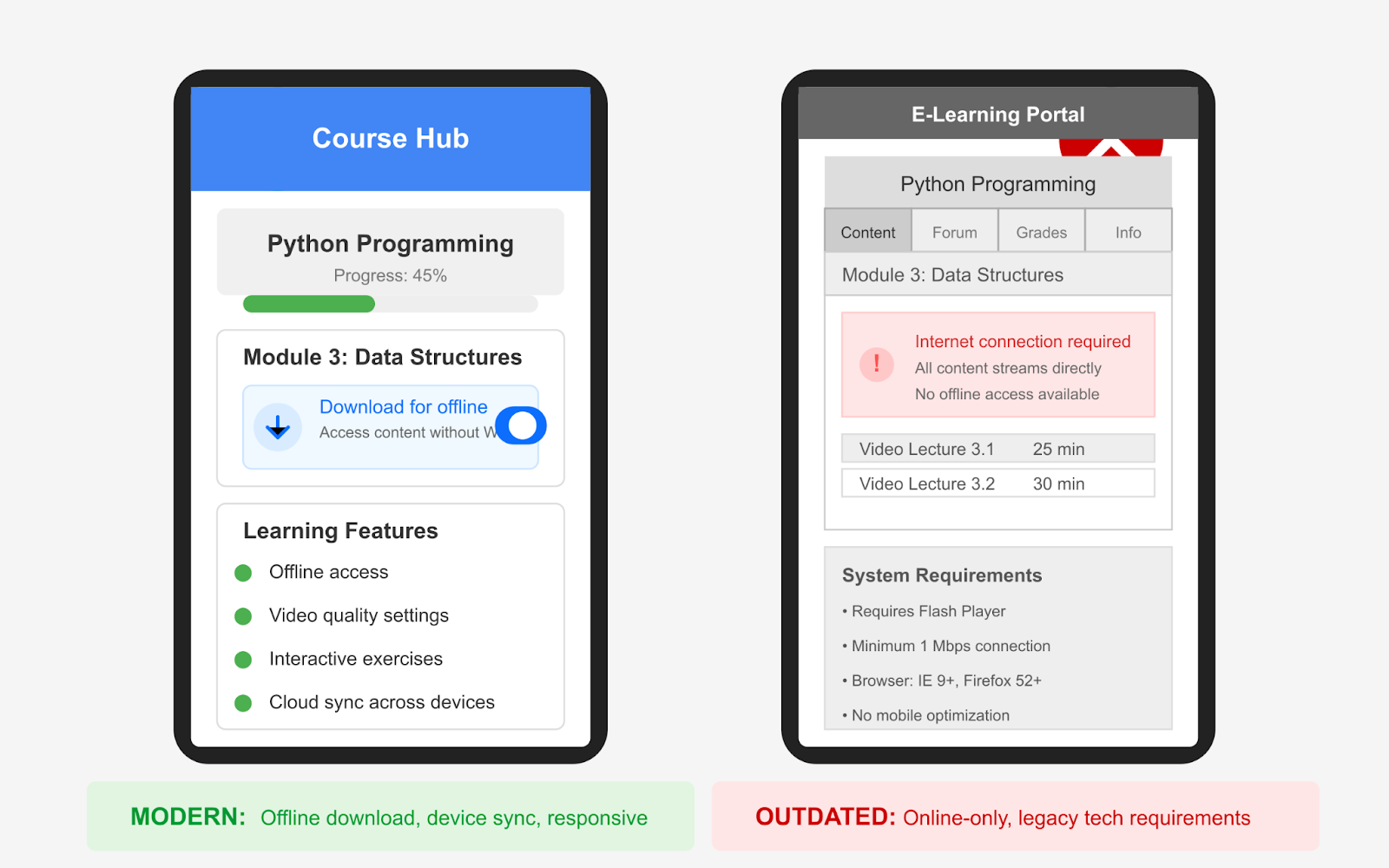
Here are a few to seriously consider:
- Offline access or downloadable resources: Give learners the option to download lessons, transcripts, or slide decks. This is especially helpful for those in low-connectivity areas or learners who want to study on the go without draining mobile data.
- Progress sync across devices: Many learners switch between their laptop, tablet, or phone. Ensuring their progress updates in real-time across all devices avoids frustration and helps them pick up right where they left off.
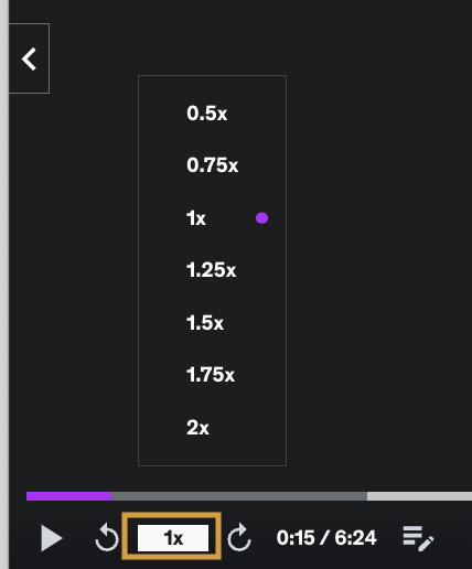
- Playback speed control for videos: Some learners prefer speeding through familiar topics, while others need to slow down for complex ones. Giving them control over the pace improves focus and retention.
- Resume prompts and reminders: A subtle message like “Continue where you left off” or “Lesson 4 is 80% complete” can nudge learners to stay on track without feeling pushy.
These features are easy to implement and show your learners that you’re thinking about their day-to-day experience, not just delivering content.
| Bonus Tip 🔥 Tools like Plyr and the Embed Any Document WordPress plugin help you add learner-friendly features without overcomplicating your course. Plyr lets users control video playback speed and resume where they left off, while Embed Any Document makes it easy to offer downloadable resources like transcripts or slides, perfect for offline access and on-the-go learning. |
How Much Optimization Is Too Much?
Let’s face it—there’s no perfect course. But small, smart improvements can make a big difference. And while perfection isn’t possible, testing and finding what works best for your learners is completely in your hands.
Design with your learners in mind. Think about where they are, what devices they use, and how they learn best. Keep the experience smooth, simple, and easy to follow.
Test what’s working. Tweak layouts. Watch how learners interact. Improve one step at a time.
In this blog, we’ve covered:
- What responsive eLearning design really means
- Why designing only for mobile and desktop isn’t enough
- How to adapt layouts for different learner contexts
- What to test and why A/B testing matters
- How to spot drop-offs early using behavior insights
- Simple features that improve the overall experience
We’ve walked you through the key technical flaws that can affect the performance and user experience of your eLearning website and course pages—and how to fix them with a responsive design approach.
Now, if you’re ready to put those insights into action, start by running a quick scan with the eLearning Technical Health Checker.
It helps you spot hidden issues—like layout bugs, mobile glitches, and scroll friction—so you can fix them early and give your learners a smooth, frustration-free experience.
If you are still unsure or overwhelmed with these steps, feel free to reach out to us. We can provide you with tailored solutions for your eLearning website issues.